Proof sheet: Notan (濃淡, dark-light harmony) represents the Japanese aesthetic concept of placing positive dark shapes and negative light spaces into equal visual tension. In apparel and print design, notan principles govern single-color screen printing, ensuring that figures and background grounds interact dynamically without relying on multi-color ink layers.
Every two-dimensional graphic begins with a void. When a dark mark touches a light surface, the designer does not merely create a positive figure; they simultaneously define the surrounding negative ground. In traditional Japanese visual philosophy, this dynamic relationship is termed notan. While Western academic art historically emphasized three-dimensional chiaroscuro shading and cast shadows, notan focuses on flat compositional equilibrium between light and dark masses. For streetwear designers and screen printers working with restricted single-color palettes, mastering notan transforms simple black-and-white ink layouts into compelling graphic statements that command visual authority across cotton apparel.
What Is Notan and How Did It Enter Western Design?
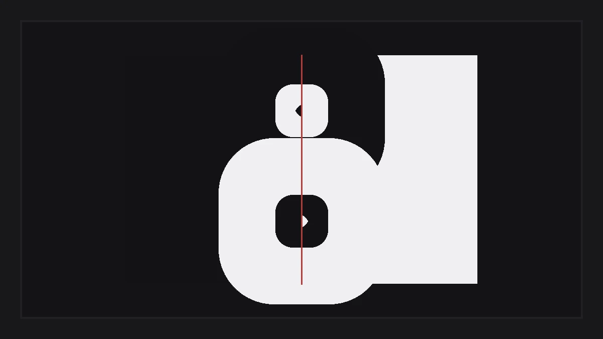
Notan is a Japanese visual concept formed from the kanji nō (濃, dark or dense) and tan (淡, light or faint). It describes the optical balance of light and dark values across a two-dimensional plane, prioritizing flat graphic tension over three-dimensional cast-shadow realism.
The philosophical origins of notan trace back to Chinese sumi-e ink wash painting and Zen Buddhist aesthetic discipline (wabi-sabi), where empty space (ma 間) carries equal spiritual weight to inked brushstrokes. The concept entered Western art education through specific historic bridges:
- Japanese Woodblock Prints (Ukiyo-e): During the late 19th century Japonisme movement, European and American artists encountered prints by Hokusai and Hiroshige, marvelling at how bold flat black masses anchored entire landscape compositions without gradient shading.
- Ernest Fenollosa and Arthur Wesley Dow: In the 1890s, American art educator Arthur Wesley Dow studied under Boston Museum of Fine Arts curator Ernest Fenollosa, immersing himself in Japanese brush technique and Zen design philosophy.
- Publication of Composition (1899): Dow published his landmark treatise Composition, introducing notan as one of the three foundational pillars of all visual art (alongside Line and Color). His teachings fundamentally influenced modern graphic designers including Georgia O’Keeffe.
Line and brush foundations are examined in our technical guide on Japanese calligraphy and shodo scripts.
How Did Arthur Wesley Dow Formalize Notan Principles?
Arthur Wesley Dow formalized notan as an analytical method of arranging light and dark shapes into harmonious proportions, asserting that beauty emerges not from copying nature, but from the deliberate structural relationship between positive silhouettes and surrounding voids.
Dow rejected the prevailing 19th-century academic European practice of realistic pencil imitation. Instead, he trained artists to analyze visual space through three structural exercises:
- The Cut-Paper Square Exercise: Students cut organic or geometric shapes from the perimeter of a black square, folding each cut piece outward into surrounding white space. The exercise demonstrates that removing a dark shape simultaneously expands a light shape, enforcing 50/50 area equilibrium.
- Equivalence of Figure and Ground: Neither the black figure nor the white background is passive. If the negative white spaces do not form compelling, intentional shapes of their own, the overall design fails mechanically.
- Reversible Compositions: In a flawless two-value notan arrangement, inverting the colors (swapping black for white) preserves identical graphic energy without losing composition balance.
Symmetrical emblem structures are detailed in our historical study of kamon Japanese family crests.
What Are Two-Value and Three-Value Notan Structures?
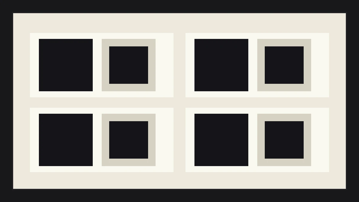
Two-value notan utilizes only pure black and pure white shapes to establish stark graphic contrast, while three-value notan introduces an intermediate midtone gray (half-tint) to create spatial depth and tonal progression across flat surfaces.
Applying value structures to physical apparel graphics requires analyzing tonal hierarchies:
- Two-Value Graphic Systems (Black and White): The core workhorse of street apparel design. Two-value notan relies entirely on silhouette contour, negative space cutouts, and shape scale. Because intermediate grays do not exist in two-value layouts, every edge must be decisive.
- Three-Value Systems (Black, Gray, White): Adding an intermediate gray value (often 40 to 50 percent density) allows illustrators to separate foreground figures from atmospheric backgrounds while maintaining flat graphic restraint.
- Value Distribution Ratios: Professional print designers apply the 60-30-10 rule: 60 percent dominant background mass, 30 percent secondary supporting shape, and 10 percent high-contrast focal accent. Balancing these ratios prevents visual clutter.
Halftone dot systems and line frequency limits are documented in our review of screentone in manga and print.
How Does Notan Guide Single-Color Screen Printing?
Notan principles allow screen printers to produce visually rich garments using only a single screen and one ink color, maximizing production efficiency and garment breathability while avoiding the heavy, rubbery hand feel of multi-layered plastisol ink coats.
In commercial garment decoration, single-color printing is the most economical and durable production method. Applying notan principles transforms physical ink restrictions into aesthetic strengths:
- Fabric Color as Active Ground: In single-ink printing on a black shirt, the black cotton fabric is not merely empty space; it acts as the primary dark mass of the notan structure. White or cream ink forms the opposing light value.
- Eliminating Thick Underbases: Because the design balances positive ink with open fabric apertures, the garment retains a light, breathable drape (soft hand feel) that flexes naturally across the chest.
- Negative Space Line Work: Rather than printing thick white outlines that crack over time, skilled designers cut thin channels through white ink blocks, allowing black fabric threads to construct character contours.

Explore broader streetwear design in the Design and Streetwear section.
Notan Aesthetic Myths and Technical Facts Matrix
The comparative matrix below dispels common misconceptions surrounding notan, contrasting Western academic assumptions with authentic Japanese design principles and garment printing reality.
| Topic | Common Western Myth | Authentic Design Reality | Apparel Production Impact |
|---|---|---|---|
| Art Form vs Concept | Notan is an isolated Japanese painting medium | Notan is a universal design principle of value harmony | Applies across screen printing, embroidery, and typography |
| Light and Shade | Notan is identical to Western chiaroscuro | Chiaroscuro models 3D form; notan balances flat 2D masses | Prevents muddy halftone gradients on rough cotton jersey |
| Color Relevance | Notan only applies to black and white artwork | Notan governs value underlying all multi-color palettes | Ensures color graphics read clearly when photographed in B&W |
| Negative Space | Negative space is passive leftover background | Negative space is an active, equal graphic component | Reduces total ink coverage, improving garment breathability |
| Complexity | More intricate details produce superior designs | Graphic reduction creates more memorable visual impact | Improves screen washout and print durability across wash cycles |
Apparel Graphic Notan Inspection Checklist
Garment collectors review mechanics, origins, finish, styling, timeline, and stitch density on each vintage piece before purchase. Before finalizing a black-and-white graphic for garment printing, verify these five notan checkpoints:
- Squint Test for Value Balance: Squint at the artwork from 6 feet away. Ensure the overall composition divides into approximately equal masses of light and dark rather than a tiny focal dot in empty space.
- Check Reversibility of Shapes: Invert artwork colors in editing software. Verify that the inverted version creates compelling negative shapes and does not appear disorienting.
- Audit Enclosed Negative Voids: Confirm that negative space cutouts have intentional contours rather than generic geometric gaps.
- Verify Ink Area Under 60 Percent: Keep total printed ink coverage below 60 percent of total graphic boundary area to preserve garment flexibility and hand feel.
- Ensure Silhouette Legibility: Fill the entire subject with solid black ink. Confirm that the character or motif remains instantly identifiable by external outline alone.
Notan reminds designers that what is omitted from a garment graphic is just as vital as what is printed, elevating single-ink apparel through timeless spatial equilibrium.
Press check
What is the difference between notan and chiaroscuro?
Chiaroscuro is a European Renaissance technique using gradual lighting gradients and shadows to model three-dimensional volume and depth. Notan is a Japanese principle focusing on the flat structural harmony and proportional balance between positive and negative shapes across a two-dimensional surface.
Why is notan essential for single-color screen printing?
In single-color screen printing, the printer cannot use multiple ink colors to create visual hierarchy. Notan allows the artist to use the garment fabric color as an active graphic component, creating depth and dynamic rhythm using only one ink layer.
Can notan principles be applied to full-color graphic designs?
Yes. Every color possesses an underlying value (lightness or darkness). By converting a full-color design to grayscale, designers can check its notan structure to verify that adjacent hues carry sufficient value contrast to remain readable.
Who introduced the concept of notan to Western graphic design?
American artist and educator Arthur Wesley Dow introduced notan to Western education in his 1899 book Composition, after studying traditional Japanese art principles under Boston Museum curator Ernest Fenollosa.
How we researched this: historical treatises on Japanese aesthetics, Arthur Wesley Dow’s educational publications, and commercial screen printing prepress methods were synthesized to establish practical design criteria. Initial structuring utilized automated drafting tools; the editor verified aesthetic citations and finalized typographic prose.
Sources: Arthur Wesley Dow “Composition” (1899), Boston Museum of Fine Arts Fenollosa Archives, Screen Printing Association Technical Publications.