Type, ink and the graphic tee
Design for the chest, not the screen
Esra Graphic Design explains why some shirt graphics read from across a room and others turn to blur at chest width. Typography, the screen and the press, and the long history of printed tees and posters, written for people who design them or simply notice them.
Read the notesHow a print is built
One color, one screen. Every graphic tee starts as a stack of separations.
- Screen 1Underbase
A white layer laid first on dark fabric so the colors above it stay bright.
- Screen 2Color fields
Each flat color gets its own mesh and its own pass of the squeegee.
- Screen 3Key line
The darkest layer goes last and hides small gaps where the others meet.
From the shop
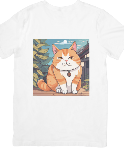
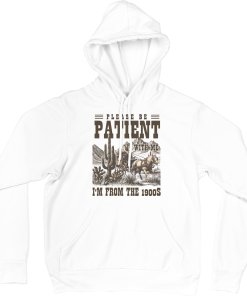
A few printed pieces from the Esra Graphic Design shop, shown for reference.
-
-
- T Shirt
Fat Ginger Cat Cute
- $19.99
-
Latest from the blog
All notes →- Notan in Graphic Design: Dark and Light Harmony in PrintA design analysis of notan in graphic art: dark-light balance, Arthur Wesley Dow’s principles, positive-negative space, and one-color screen print rules.
- Left Chest Logo Size: Dimensions, Placement, and LimitsAn industry guide to left chest logo size standards: dimensions in inches and cm, placement coordinates, embroidery text limits, and vertical type rules.
- Japanese Calligraphy: Shodo Scripts, Brushes, and PrintA guide to Japanese calligraphy (shodo) on garments: the three major scripts, the four treasures, dry-brush vectorization, and screen print limits.
- Kamon Japanese Family Crests: Design, History, and MeaningA design guide to Japanese kamon family crests: circular geometry, samurai heraldry, formal kimono placement, and chest logo embroidery rules.
- Screentone in Manga: History, Halftone Angles, and PrintA technical guide to screentone in manga: Ben-Day dot origins, adhesive transfer sheets, line frequency, and screen printing on cotton.
- Sukajan Souvenir Jackets: History, Stitches, and CraftA guide to authentic Japanese sukajan souvenir jackets: post-war Yokosuka beginnings, rayon satin drape, and traditional embroidery craft.
Posts here are signed Iris Kovac. Claims about type and printing are traced to printing-industry references and foundry documentation before anything goes up. An AI tool helps rough out the structure; an editor writes and checks the final text. The blog stays out of politics entirely.