Proof sheet: A kamon (家紋, Japanese family crest) is a circular heraldic emblem that originated among Heian nobility before evolving into samurai battlefield insignia and merchant guild trademarks. Formatted within strict geometric compass grids, authentic mon utilize stylized botanical, geometric, or animal motifs designed for high-contrast visibility at small chest dimensions.
Heraldry in Japanese visual culture is defined by geometric restraint. While European coats of arms incorporate elaborate shields, mottos, and complex multi-color crests, Japanese kamon express clan lineage through minimalist silhouette emblems enclosed within circular boundaries. For apparel designers and visual artists, studying traditional crest geometry offers masterclass lessons in negative space balance, reductionist vector styling, and graphic durability across textile knits. Understanding how Japanese artisans created over twenty thousand distinct crest variations using compass lines provides foundational rules for crafting modern chest marks.
What Are the Historical Roots of Kamon in Japan?
Kamon originated during the Heian period (794 to 1185) as decorative patterns chosen by court nobles to distinguish their aristocratic carriages, lacquered furnishings, and formal silk robes. During the Kamakura period (1185 to 1333), the warrior samurai class adopted crests as functional identification emblems on battlefield flags and armor.
The progression of Japanese crest heraldry unfolded across four distinct social transformations:
- Aristocratic Carriage Mon (Heian Period): Courtiers decorated ox-drawn carriages (gissha) with distinctive woven textile motifs to prevent congestion and clarify carriage ownership outside the Imperial Palace in Kyoto.
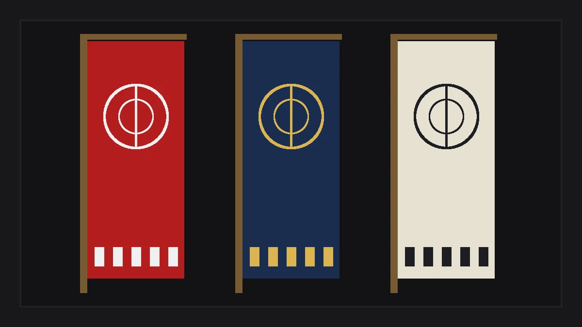
- Battlefield Heraldry (Sengoku Period): Feudal lords (daimyo) and mounted warriors displayed mon on vertical military banners (nobori), chest breastplates, and cavalry standards so troops could distinguish allies from foes through battlefield smoke.
- Merchant and Commoner Adoption (Edo Period): Under Tokugawa peace, the merchant class and common citizens adopted family crests on shop awnings (noren), kabuki actor promotional banners, and formal cotton festival coats (happi).
- Modern National Symbolism (Meiji Period): Following the Meiji Restoration in 1868, commoners were legally required to register surnames and family crests, while specific sacred emblems like the Imperial Chrysanthemum became protected state symbols.
Traditional dye choices and cultural color restrictions are documented in our guide to traditional Japanese colors on apparel.
How Does Circular Geometry Govern Kamon Design?
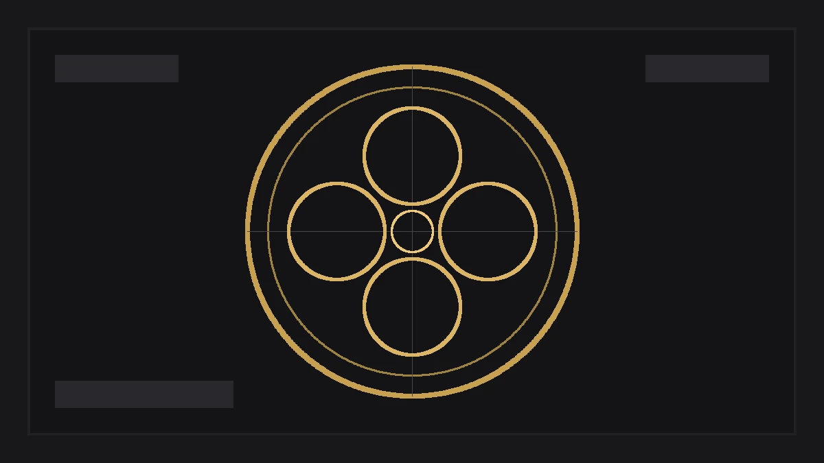
Traditional kamon are drafted using strict geometric compass grids enclosed within a circular outer boundary ring known as a maru. Artisans construct complex natural motifs, including falcon feathers, bamboo shoots, and waves, using tangent circles, arcs, and radial symmetry axes without arbitrary freehand lines.
The geometric discipline of mon drafting creates balanced visual weight that scales effortlessly from tiny seals to massive building banners. Graphic designers analyze three core anatomical components when studying traditional mon construction:
- Outer Ring (Maru 輪): The circular perimeter frame. Crests are classified as maru-ni (within a circle) when bordered by a line, or unbordered when the central silhouette stands freely. Line thickness ranges from delicate thread borders (ito-wa) to thick solid rims (futo-wa).
- Central Motif (Mon-yō 紋様): The figurative subject matter, categorized into botanical flora (cherry, paulownia, plum), fauna (crane, butterfly, hawk feathers), natural phenomena (clouds, waves, lightning), and manufactured artifacts (swords, arrows, fans, coins).
- Symmetry Rules (Tōbun 等分): Most crests employ bilateral symmetry (two-fold reflection) or rotational symmetry based on three (mitsuba), four (yotsuba), five (itsutsu), or six-fold radial geometry.
Geometric textile patterns often share these exact drafting principles, as detailed in our analysis of Japanese geometric patterns on textiles.
How Are Crests Positioned on Formal Kimono?
On traditional Japanese formal garments, crests are applied in five standardized locations known as itsutsu-mon. These placements sit on the center back spine, the back of both sleeves, and both front chest panels, establishing the historical precedent for modern left-chest and back-panel apparel graphics.
Garment formality correlates directly with crest quantity and application technique in Japanese ceremonial wear:
- Five Crests (Itsutsu-mon 五つ紋): The highest formality level, worn on black silk formal kimono (kurotomesode) and formal montsuki haori for weddings and state ceremonies. One crest sits centered on the back neck, two on the sleeve backs, and two on the upper chest.
- Three Crests (Mitsu-mon 三つ紋): Semi-formal attire featuring one back crest and two sleeve crests, omitting the chest placements.
- One Crest (Hitotsu-mon 一つ纹): Understated formal wear featuring a single mon placed centered below the back collar seam.
- Application Methods: Crests were traditionally reserved through resist-dyeing (sominuki), where silk fabric remained un-dyed white inside the crest circle, or hand-embroidered (nui-mon) using fine gold and silk thread.
Thread density specifications and needle limits are examined in our study of embroidery vs screen printing on apparel.
How Did Samurai Crests Transition into Modern Logos?
During Japan’s industrial modernization in the late 19th and 20th centuries, prominent samurai merchant trading houses converted their traditional kamon into corporate trademarks, establishing the minimalist visual identity of modern global Japanese conglomerates.
The graphic simplicity of kamon directly influenced 20th-century Swiss style graphic design and international corporate branding. Major Japanese corporate marks trace their lineage directly to Edo-period clan emblems:
- Mitsubishi (Three Diamonds): Formed by combining the three-tiered water chestnut crest of the Iwasaki family with the three oak leaves crest of the Tosa Yamauchi samurai clan.
- Kikkoman: Features the hexagonal tortoise shell (kikko) crest enclosing the kanji for ten thousand (man 萬), symbolizing longevity and culinary heritage.
- Yamaha: Three interlocking tuning forks arranged within a circular mon boundary, echoing traditional tripartite radial wheel crests (mitsuba-guruma).
- Protected Emblem Restrictions: The sixteen-petal Chrysanthemum Crest (Kikukamon) remains restricted exclusively to the Emperor and Imperial Family, while the Paulownia Crest (Go-Shichi no Kiri) serves as the official seal of the Japanese Government and Cabinet Prime Minister.
Explore broader motif history in the Motifs and Color section.
Japanese Crest Motif Classification Matrix
The comparative matrix below outlines five primary kamon design families, typical motif examples, cultural meanings, and textile print execution considerations.
| Motif Category | Historical Example | Cultural Meaning | Symmetry Structure | Garment Print Execution |
|---|---|---|---|---|
| Botanical (Flora) | Mokko (Melon), Sakura, Kiku | Prosperity, vitality, seasonal renewal | Four-fold and five-fold radial | Excellent for left chest direct embroidery |
| Avian and Animal | Tsuru (Crane), Takanoha (Hawk) | Longevity, martial focus, vigilance | Bilateral mirror reflection | Requires clean outline vectorization |
| Astronomical / Nature | Tsuki (Moon), Hoshi (Stars), Nami | Guidance, cosmic order, persistence | Concentric circular offsets | Ideal for clean single-color screen printing |
| Manufactured Objects | Ogi (Folding Fan), Ya (Arrows) | Expansion, martial honor, readiness | Rotational cluster geometry | High visual impact at small pocket scales |
| Geometric Figures | Ichimatsu (Checks), Shippo, Kikko | Eternity, family harmony, resilience | Tessellated infinite repeat | Adapts across all-over yardage prints |
Apparel Vector Crest Inspection Checklist
Garment collectors review mechanics, origins, finish, styling, timeline, and stitch density on each vintage piece before purchase. When vectorizing a traditional kamon emblem for screen printing or chest embroidery, verify these five production criteria:
- Audit Minimum Line Thickness: Ensure all circular perimeter rings and internal dividing lines measure at least 0.75 points for screen printing or 1.0 mm for embroidery satin columns.
- Verify Counter-Space Clearance: Check that negative spaces between interlocking petals do not choke with wet ink during high-speed textile screen runs.
- Avoid Protected Imperial Emblems: Confirm the artwork does not reproduce the sixteen-petal Imperial Chrysanthemum or government-reserved paulownia seals.
- Scale Test at 2.5 to 3.5 Inches: Print a 1:1 paper proof sheet at left-chest size to confirm all interior lines remain visually legible at conversational distances.
- Check Center Axis Alignment: Balance the geometric center of circular mon with the optical center of garment chest placements to prevent asymmetrical sagging.
Kamon designs represent centuries of refined graphic reduction, proving that simple geometric silhouettes communicate identity with greater clarity and staying power than complex multi-color emblems.
Press check
Can anyone wear or use a Japanese kamon on clothing?
In modern Japan, common kamon are considered shared cultural heritage and can be worn decoratively by anyone without legal restriction. However, the sixteen-petal Imperial Chrysanthemum crest and the official government paulownia seal are protected emblems reserved for imperial and state functions.
What is the difference between a kamon and a European coat of arms?
A kamon is monochromatic, strictly enclosed within simple circular geometric boundaries, and represents family lineage. European coats of arms are multi-colored, highly complex assemblies of shields, crests, supporters, and mottos granted to specific individuals rather than entire extended households.
Why are most Japanese crests enclosed in a circle?
The outer circular ring (maru) provided structural balance, represented cosmic completeness (the universe and harmony), and allowed samurai armory decorators to apply uniform emblem sizes across curved helmet bowls, circular lacquered shields, and chest armor.
What is the recommended size for a kamon embroidered on a shirt?
For adult apparel left-chest placement, an embroidered kamon should measure between 2.5 and 3.5 inches (6.5 to 9 cm) in diameter. Smaller sizes below 2 inches risk losing fine petal separation, while sizes exceeding 4 inches feel uncomfortably rigid on lightweight cotton jersey.
How we researched this: historical lineages, kimono decoration rules, and geometric construction principles were cross-referenced from Tokyo National Museum catalog archives and traditional crest dictionaries (Mondokoro). Initial structuring utilized automated drafting tools; the editor verified historical citations and finalized typographic prose.
Sources: Tokyo National Museum Heraldic Collections, Japan Heraldry Society Historical Publications, Kyoto Craft Guild Documentation.