Proof sheet: Japanese calligraphy (shodō, 書道) encompasses three foundational script styles: Kaisho (precise block), Gyōsho (semi-cursive running), and Sōsho (expressive grass script). Reproducing calligraphic brush work on apparel requires capturing dry-brush ink streaks (kasuri) without overwhelming screen printing meshes with millions of microscopic vector anchor points.
The stroke of a hair brush holds dynamic physical pressure. In Japanese visual culture, shodō is regarded as both literary communication and performance art, where speed, ink viscosity, and paper absorption record the artist’s physical breath. When translating japanese calligraphy onto clothing, graphic designers encounter immediate technical friction between organic handwork and industrial textile replication. Soft ink gradients, delicate trailing terminals (hane), and bristled dry-brush textures that look magnificent on absorbent washi paper can choke screen printing emulsions or produce severe vector file lag during digital prepress. Understanding script classifications and vector preparation rules ensures calligraphic artwork prints cleanly onto cotton fabrics.
What Are the Three Foundational Shodo Scripts?
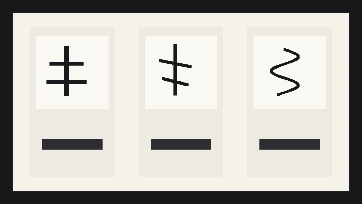
Japanese calligraphy organizes brush writing into three primary script styles developed across centuries of East Asian literacy: Kaisho (block style), Gyōsho (semi-cursive running style), and Sōsho (highly abstracted cursive grass style). Each script varies fundamentally in execution speed, stroke connectivity, and reading accessibility.
Master calligraphers distinguish scripts by structural discipline and kinetic tempo:
- Kaisho (Block Script 楷書): The standard formal writing style. Every brush stroke is lifted cleanly from the paper before initiating the next stroke. Kaisho emphasizes precise balance, defined corners, and immediate legibility, making it the most reliable script for garment typography and instructional text.
- Gyōsho (Running Script 行書): A semi-cursive style where adjacent strokes blend into continuous fluid motions without lifting the brush entirely. Corners round gracefully, stroke order condenses naturally, and character rhythm conveys relaxed movement while retaining broad reading accessibility.
- Sōsho (Grass Script 草書): An extreme cursive script where complex multi-stroke kanji reduce into swift, energetic, single-loop gestures. Sōsho prioritizes kinetic expression and spatial rhythm over literal legibility, often readable only by trained calligraphy scholars.
Foundational type families are compared in our companion guide on Japanese fonts for apparel.
What Are the Four Treasures of the Calligrapher?
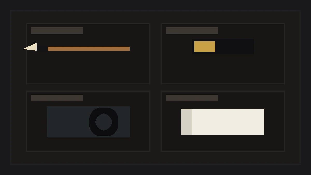
The calligraphic process relies on four traditional instruments collectively known as the Four Treasures of the Study (bunbō shihō 文房四宝): the brush (fude), the ink stick (sumi), the ink stone (suzuri), and handmade mulberry paper (washi).
The tactile interaction between these tools establishes the distinctive edge character of calligraphic letterforms:
- Fude (The Brush 筆): Crafted from animal hair (goat, wolf, badger, or horse hair) bundled into a conical tip. Soft goat hair holds abundant liquid for swelling lines, while stiff horse hair provides spring and crisp snap at stroke terminals.
- Sumi (The Ink Stick 墨): Compressed pine soot or mineral lampblack bound with animal hide glue (nikawa) and subtle aromatics. Grinding the stick with pure water on a stone slate produces rich carbon black pigment with microscopic particles that resist fading for centuries.
- Suzuri (The Ink Stone 硯): A carved slate or shale stone featuring a flat grinding incline (riku) and a deep ink reservoir (umi). The micro-abrasive tooth of the stone grinds the solid ink stick into velvety liquid.
- Washi (Handmade Paper 和紙): Fibrous paper produced from kozo (mulberry) or mitsumata bark. The capillary action of natural plant fibers draws ink outward, producing soft halo blooms (nijimi) along stroke edges.
Historical color practices and ink formulations are detailed in our analysis of traditional Japanese colors on apparel.
How Should Calligraphic Brush Strokes Be Vectorized?
Converting raw ink-on-paper calligraphy into production-ready digital vector artwork requires high-resolution optical scanning (at least 1200 DPI monochrome) and controlled threshold vector tracing that preserves dry-brush texture without creating excessive Bézier anchor point blooms.
Raw automated software tracing of textured brushwork often generates files containing over fifty thousand micro-paths per character, causing RIP processing crashes on digital garment printers. Follow these prepress steps to balance aesthetic texture with production stability:
- Scan at High Optical Resolution: Capture original brushwork at 1200 DPI in 16-bit grayscale. Avoid initial binary thresholding on the scanner bed, which crushes delicate feathering.
- Filter Micro-Speckles in Raster Software: Use median filters or dust-and-scratches brushes to eliminate isolated ink droplets smaller than 0.5 mm that would wash out during screen washout.
- Optimize Vector Path Fidelity: In vector software, adjust path fitting thresholds to smooth tiny jagged notches while retaining the macro profile of split-hair bristles (kasuri).
- Consolidate Compound Paths: Merge overlapping vector loops into single compound shapes to prevent laser cutters and film plotters from cutting intersecting internal vectors twice.
Screen printing mesh thresholds are evaluated in our technical reference on screentone in manga and print.
What Screen Printing Limits Govern Calligraphy on T-Shirts?
Printing authentic brush strokes on cotton t-shirts requires matching dry-brush stroke width to screen mesh apertures. Fine bristle wisps thinner than 0.75 points fail to hold emulsion on 110 or 156 mesh screens, causing the characteristic frayed texture of calligraphy to wash away during press setup.
Garment decorators must accommodate the physical limits of wet ink and fabric yarn textures:
- Screen Mesh Selection (200 to 230 Mesh): To hold delicate dry-brush fray, printmakers use tensioned 200 or 230 mesh screens coated with sharp dual-cure emulsions. Coarse 110 mesh screens lack the aperture resolution needed to anchor fine bristle tips.
- Ink Viscosity and Squeegee Pressure: High-solids acrylic water-based inks yield superior edge sharpness for calligraphy compared to thick plastisol. Stiff rubber squeegees (75 to 80 durometer) shear ink cleanly across mesh openings without flooding delicate bristle voids.
- Underbase Management on Dark Fabrics: Printing white calligraphy on black garments requires a choke-back underbase (1 to 2 points smaller than the top art) to prevent white ink halos from muddying feathered bristle edges.
- Embroidery Conversion Realities: Transferring calligraphy to embroidery requires manual stitch digitizing. Automated embroidery software cannot translate dry-brush fray into thread, requiring clean satin stitch columns that capture the gesture while simplifying micro-wisps.
Explore broader typographic design in the Japanese Type section.
Japanese Calligraphy Script Comparison Matrix
The comparative matrix below outlines the three major shodō script styles, summarizing historical origins, stroke speed, legibility index, and apparel decoration suitability.
| Script Style | Japanese Name | Execution Tempo | Legibility Rating | Garment Print Recommendation |
|---|---|---|---|---|
| Kaisho (Block) | 楷書 (Kaisho) | Deliberate, paused | High (100 percent general public) | Ideal for clean pocket marks and instructional sleeve text |
| Gyōsho (Running) | 行書 (Gyōsho) | Flowing, continuous | Moderate (Accessible to literate readers) | Premier choice for expressive chest graphics and hoodies |
| Sōsho (Grass) | 草書 (Sōsho) | Rapid, kinetic | Low (Specialized calligraphic art) | Best used as abstract graphic back-print motifs |
| Reisho (Clerical) | 隷書 (Reisho) | Architectural, wide | High (Historic formal seal style) | Excellent for geometric stamp seals and square chest badges |
| Tensho (Seal Script) | 篆書 (Tensho) | Symmetric, carved | Low to moderate (Ancient archaic script) | Used almost exclusively in red artist approval chops (rakukan) |
Calligraphic Apparel Print Prepress Checklist
Garment collectors review mechanics, origins, finish, styling, timeline, and stitch density on each vintage piece before purchase. Before sending calligraphic artwork to film output or screen exposure, verify these five production steps:
- Verify Stroke Weight Minimums: Confirm that the thinnest dry-brush bristle wisps measure at least 0.75 points (0.26 mm) to prevent emulsion washout on press.
- Include Red Artist Seal (Hankō / Rakukan): Balance black brush letterforms with a small square cinnabar-red artist seal placed to the lower left of vertical text columns.
- Check Kanji Stroke Accuracy: Review complex kanji characters with a native Japanese speaker or dictionary to verify that artistic flourish did not omit critical stroke components.
- Select High-Mesh Screens (200+ Count): Burn calligraphic screens using at least 200 threads per inch mesh tensioned to 25 Newtons per centimeter.
- Test Print on Fabric Swatch: Run a test print on scrap garment jersey to verify ink release and ensure bristle gaps do not flood with wet plastisol ink.
Mastering calligraphic typography bridges historic brush artistry with modern streetwear, creating garments that convey kinetic energy through balanced black and white tension.
Press check
What is the difference between shodō and standard Japanese brush fonts?
Shodō is live, unrepeatable hand calligraphy executed in real-time with organic variations in pressure, speed, and ink saturation. Brush fonts are digital computer typefaces with static vector outlines that repeat identical glyph shapes every time a letter is typed.
Why does dry-brush calligraphy blur when screen printed on cotton?
Dry-brush blur happens because liquid ink bleeds into porous cotton yarns (ink gain) and coarse screen mesh cannot hold microscopic bristle gaps, causing delicate textured voids to fill with solid ink during squeegee strokes.
What does the red square stamp next to Japanese calligraphy mean?
The red stamp is a rakukan (落款) or hankō seal carved from stone or wood and stamped in cinnabar paste. It represents the personal signature or artist seal of the calligrapher, authenticating that the artwork is finished and verified.
Can Japanese calligraphy be converted directly into embroidery?
Direct automated vector conversion creates jagged, un-sewable stitches. Authentic calligraphic embroidery requires manual digitizing where an experienced digitizer builds smooth satin columns and intentional needle penetrations that mirror the brush gesture without knotting thread.
How we researched this: historical script lineages, brush tool physics, and textile screen printing prepress procedures were compiled from Japan Calligraphy Art Academy documentation and professional garment screen printing technical journals. Initial structuring utilized automated drafting tools; the editor verified script parameters and finalized typographic prose.
Sources: Japan Calligraphy Art Academy Documentation, Tokyo National Museum Calligraphy Archive, Screen Printing Association Prepress Standards.