Proof sheet: Traditional japanese colors (dentō-shoku 伝統色) on apparel originate from natural plant and mineral dyes established during the Asuka, Heian, and Edo periods. Core color families include natural indigo (aizome 藍染), safflower crimson (beni 紅), and muted tea tones (cha-iro 茶色). Screen printing authentic Japanese palettes requires matching spot inks to historic textile references.
Color choices on traditional garments historically communicated social rank, seasonal transitions, and poetic refinement. Designers applying japanese colors to modern graphic apparel and streetwear must navigate historical dye sources, optical pigment balances, and textile screen printing formulations. Rather than utilizing harsh primary synthetics, traditional Japanese color palettes emphasize muted, earthy tonal balances derived from botanical infusions, wood ashes, and mineral mordants. Understanding the historical context and optical values of dentō-shoku ensures that modern garments convey genuine cultural depth.

What Are Dentō-shoku Traditional Japanese Colors on Garments?
Dentō-shoku (伝統色) comprises over four hundred historically recognized color shades documented across classical Japanese literature, court sumptuary codes, and dye manuals. Derived strictly from botanical, animal, and mineral sources, these colors emphasize subtle, complex undertones rather than saturated artificial primaries.
The philosophical approach to color in classical Japan developed through close observation of seasonal changes. Early court codes, such as Prince Shōtoku’s Twelve Level Cap and Rank System established in 603, assigned specific colors to court officials:
- Purple (Murasaki 紫): Extracted from gromwell root (murasaki-gusa), purple represented the pinnacle of court status due to the rarity and labor-intensive extraction of the dye.
- Safflower Crimson (Kurenai / Beni 紅): Derived from safflower petals (benibana), yielding delicate pinks to deep scarlet reds favored for ceremonial robes.
- Charcoal and Ink (Sumi 墨): Carbon soot from pine wood mixed with animal glue, producing warm, nuanced dark grays and neutral backdrops.
When applying these historic shades to cotton apparel, designers must recognize that traditional dyes were inherently semi-translucent, interacting directly with underlying silk, hemp, or unbleached cotton fibers. Formulating screen printing inks with subtle tint bases captures this historical nuance far more effectively than flat opaque process inks.
Color styling intersects with geometric motifs detailed in our guide to traditional Japanese patterns on apparel.
How Did Japanese Indigo Aizome Establish Textile Heritage?
Japanese indigo dyeing, known as aizome (藍染), represents the most influential textile coloration process in Japanese history. Extracted from fermented *Polygonum tinctorium* (tadeai) leaves, indigo produces over twenty named tonal gradations ranging from pale watery blue to near-black navy.
The chemistry of natural aizome involves anaerobic microbial fermentation inside earthen vats. Dried, composted indigo leaves called sukumo are mixed with wood ash lye (aku), wheat bran, and slaked lime. Dipping cotton cloth into the yellowish fermentation liquid produces no immediate blue color; oxidation upon exposure to air converts soluble leuco-indigo into insoluble blue pigment locked deep inside cotton fiber lumens.
Historical indigo gradations provided distinct functional and aesthetic roles across Japanese society:
- Kamenoki / Kamezoki (甕覗): A pale, watery sky blue achieved by a brief single dip into the indigo vat, literally translated as “peeking into the vat.”
- Asagi (浅葱): A light turquoise-blue associated with Edo samurai undergarments, prized for natural insect-repelling and antibacterial properties.
- Nando-iro (納戸色): A deep, grayish teal-blue widely worn by urban merchants during the late Edo period.
- Kachi-iro (勝色): An intense, near-black navy blue achieved by dozens of repeated vat immersions, adopted by samurai warriors as a victory talisman.

Modern streetwear frequently pairs deep aizome indigo bases with contrasting typography, as outlined in our study on Japanese fonts on clothing.
How Did Historic Sumptuary Laws Influence Streetwear Palettes?
During the Edo period, the Tokugawa shogunate enacted strict sumptuary laws (ken’yaku-rei) forbidding merchant classes from wearing bright silks or conspicuous colors like crimson and purple. In response, urban dyers developed sophisticated palettes of subtle grays, browns, and blues known as Edo-murasaki, Shiju-hachi-cha, and Hyaku-nezumi.
Rather than stifling creativity, bureaucratic prohibition sparked an aesthetic revolution known as iki (粋, refined, understated chic). Dyers combined persimmon tannin, iron mud baths, and walnut extracts to formulate subtle tonal variations:
- Forty-Eight Browns (Shijū-hachi Cha 四十八茶): An expansive catalog of earth tones ranging from roasted tea (hōjicha) to tobacco and plum wood shades.
- One Hundred Grays (Hyaku Nezumi 百鼠): Subtle cool, warm, and greenish gray nuances that appeared modest from a distance but revealed intricate dye depth upon close inspection.
This deliberate embrace of quiet sophistication directly prefigures modern minimalist streetwear. Designing apparel with muted olive, slate gray, and tea-brown foundations communicates historical aesthetic literacy.
Fabric decoration trade-offs between dyeing and stitching are detailed in our analysis of embroidery vs screen printing on apparel.
What Is the Seasonal Color Layering System on Garments?
Kasane no Irome (重ねの色目) represents the classical Heian aesthetic system of pairing contrasting and complementary color layers across multi-layered silk garments (jūnihitoe) to reflect specific botanical and seasonal moments in the annual calendar.
In classical court etiquette, an aristocrat’s cultural education was judged by their mastery of seasonal color combinations. The outer robe color, combined with the visible lining and collar layers, evoked specific natural phenomena:
- Spring (Haru): Sakura combinations featuring pale crimson outer layers over white linings to evoke cherry blossom buds opening against winter snow.
- Summer (Natsu): Ayame palettes pairing iris purple with fresh leaf green to mirror early summer ponds.
- Autumn (Aki): Momiji gradations transitioning from green to deep russet and maple crimson.
- Winter (Fuyu): Matsukasa arrangements pairing evergreen pine needle tones with fallen pinecone browns.
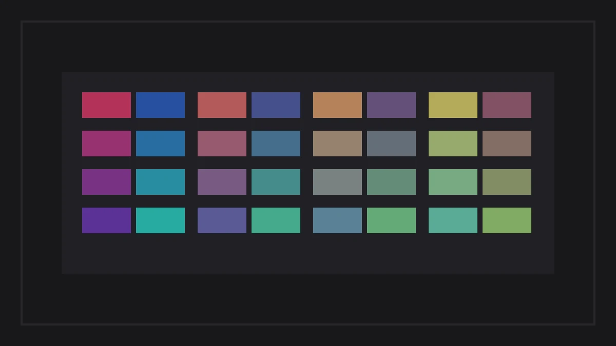
Apparel designers adapt Kasane no Irome principles to modern split-tone hoodies, two-color sleeve ribbing, and lining contrasts. Discover additional color systems in the Motifs and Color section.
Traditional Color Specification Matrix
The reference matrix below outlines historical names, Japanese kanji, approximate digital hex values, primary botanical dye sources, and optimal apparel placement for key traditional Japanese colors.
| Color Name | Japanese Name | Approx. Hex | Historic Dye Source | Apparel Placement |
|---|---|---|---|---|
| Ai (Indigo) | 藍色 | #16385C | Fermented *Polygonum tinctorium* | Heavyweight hoodies, base tees, twill jackets |
| Beni (Crimson) | 紅色 | #B9262D | Safflower petals (*Carthamus tinctorius*) | Accent chest embroidery, sleeve labels |
| Matcha (Tea) | 抹茶色 | #5D774A | Green tea leaves and oak galls | Earth-tone sweatshirts, tonal graphics |
| Sumi (Ink) | 墨色 | #28282A | Pine soot carbon and animal gelatin | Base fabric neutral, primary linework |
| Sakura-iro | 桜色 | #E6B4BE | Dilute safflower and cherry bark | Spring apparel, tonal chest prints |
| Kogane (Gold) | 黄金 | #C79A3B | Gardenia fruit (*Gardenia jasminoides*) | Metallic chest accents, woven labels |
Apparel Color Verification Checklist
Dyers formed each seasonal color palette, shaped fabric tones, studied historic kasane pairings from the edo era, noted their cultural influence, and tested wash fastness. Production teams check each physical garment finish, audit vector clearances, compare thread tensions, and review press mechanics before running high-volume batches. When preparing digital artwork and mixing spot inks for traditional Japanese palettes, verify these five production checkpoints:
- Formulate Spot Pantones: Mix custom spot inks rather than default four-color CMYK process to avoid muddying delicate traditional earth tones.
- Audit Underbase Flash Requirements: Test white underbase layers on dark fabrics to prevent muted aizome blues from appearing neon.
- Verify Dye Fastness Standards: Ensure natural dye formulations or reactive pigments meet commercial wash fastness standards without fading.
- Check Fiber Substrate Interaction: Calibrate ink absorption across 100% cotton vs poly-blends to maintain accurate dentō-shoku hues.
- Verify Cultural Symbolism: Ensure chosen seasonal colors match product release timing, honoring traditional Kasane no Irome calendar rules.
Press check
What makes traditional Japanese colors different from Western color systems?
Traditional Japanese colors (dentō-shoku) were derived strictly from natural organic dyes and minerals rather than synthetic chemicals. This reliance on plant extracts produced complex, muted tonal shades with subtle warm or cool undertones that blend harmoniously together without optical clash.
Why does natural aizome indigo smell sweet or earthy?
Natural aizome produces an earthy aroma because authentic indigo dyeing relies on anaerobic fermentation of composted indigo leaves (sukumo) with wood ash lye and wheat bran. The active living fermentation vat generates natural botanical scents distinct from synthetic chemical indigo.
Can traditional Japanese colors be reproduced accurately in screen printing?
Traditional colors can be reproduced in screen printing by utilizing custom-mixed Pantone spot inks with semi-translucent tint bases. Semi-translucent ink formulations allow subtle fabric texture to show through, replicating the historical depth of vat-dyed textiles.
What was the purpose of the Edo period Forty-Eight Browns?
The Forty-Eight Browns (Shijū-hachi Cha) were developed by urban dyers to bypass samurai sumptuary laws banning bright clothing. By creating dozens of sophisticated brown nuances from tree barks and tannin extracts, merchants demonstrated refined style while obeying legal modesty decrees.
How we researched this: historical dye formulations, sumptuary edict records, and color specifications were gathered from Japanese museum textile collections and cultural heritage archives. Drafting utilized automated structuring; the editor confirmed historical dates and finalized typographic prose.
Sources: Agency for Cultural Affairs Traditional Crafts Documentation, Tokyo National Museum Textile Collection, Japan Folk Crafts Museum Dye Archives.